Micromine 2018 now incorporates the University of Western Australia’s Centre for Exploration Targeting (CET) collection of perceptually uniform colour maps, which can be used to display geological, geophysical, and geochemical data that vary over a continuous range. Perceptually uniform means that the visible difference between any two colours in a palette only depends on how far apart they are on the palette. The actual hue, saturation, or brightness of each colour is irrelevant.
In other words, the difference between two colours at the dark end of a palette, separated by 10 units (in the colour space), will appear to be the same as two colours separated by 10 units at the bright end of the palette.
So, what does this mean in the real world? Here’s a geophysical (aeromagnetic) image, displayed in 3D Shaded mode with default lighting and no other enhancements:
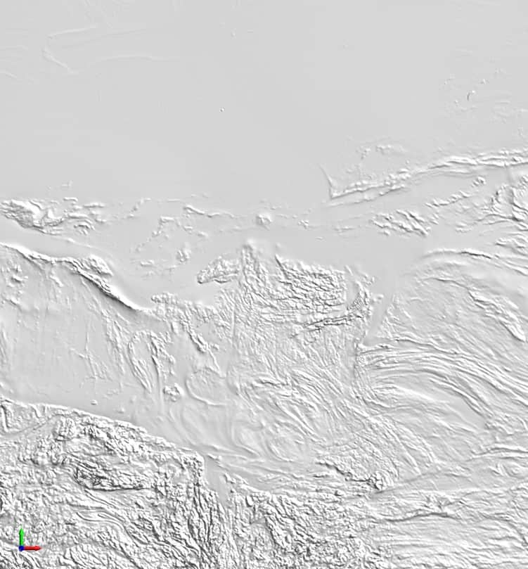
Even without enhancement, you can easily see areas of high geophysical relief at the bottom of the image. Not so obvious are the areas of low relief near the top.
Now let’s see how it looks when we experiment with these colour palettes. Colour set values in the examples were determined by dividing the full data range into 255 quantiles (256 colours). The lighting and colour set divisions are always the same; only the colours change between examples.
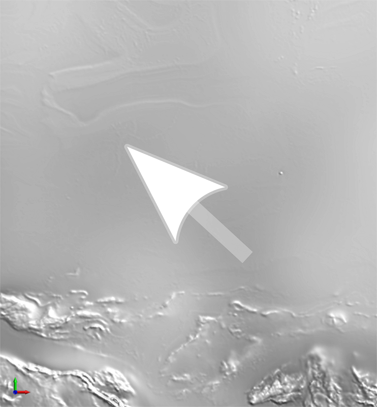
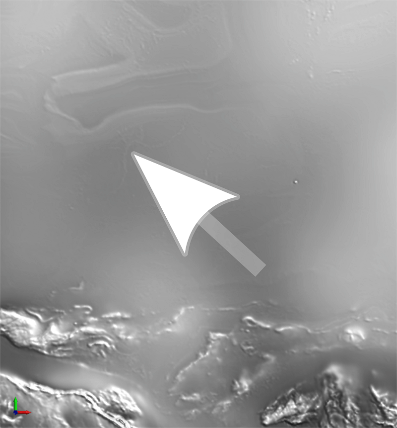
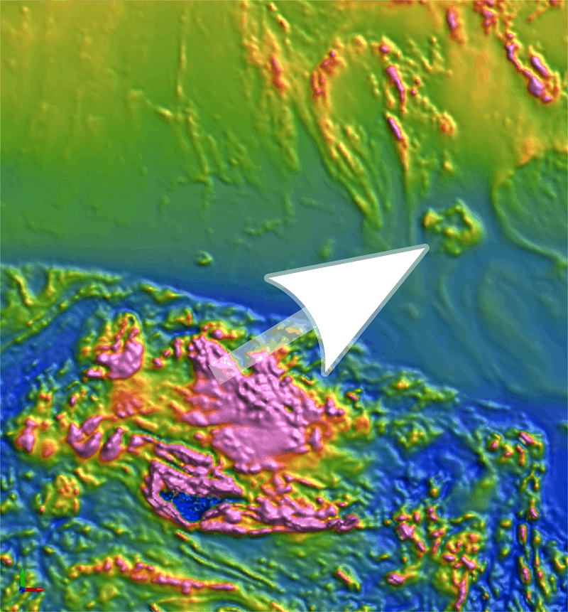
First, a greyscale comparison in a region with low relief. The left-hand image uses Micromine’s Greyscale – Gamma 05 palette, the right uses the CET linear_grey_0_100_c0_n256 palette. Note how the region immediately above the arrowhead appears almost featureless in the left image, but if you look carefully at the right image, you’ll discover a network of tiny channels wrapping around the arrowhead (they are much easier to see in the full-resolution images). The difference is subtle, but could easily make the difference between seeing or missing important palaeochannels.
 |
 |
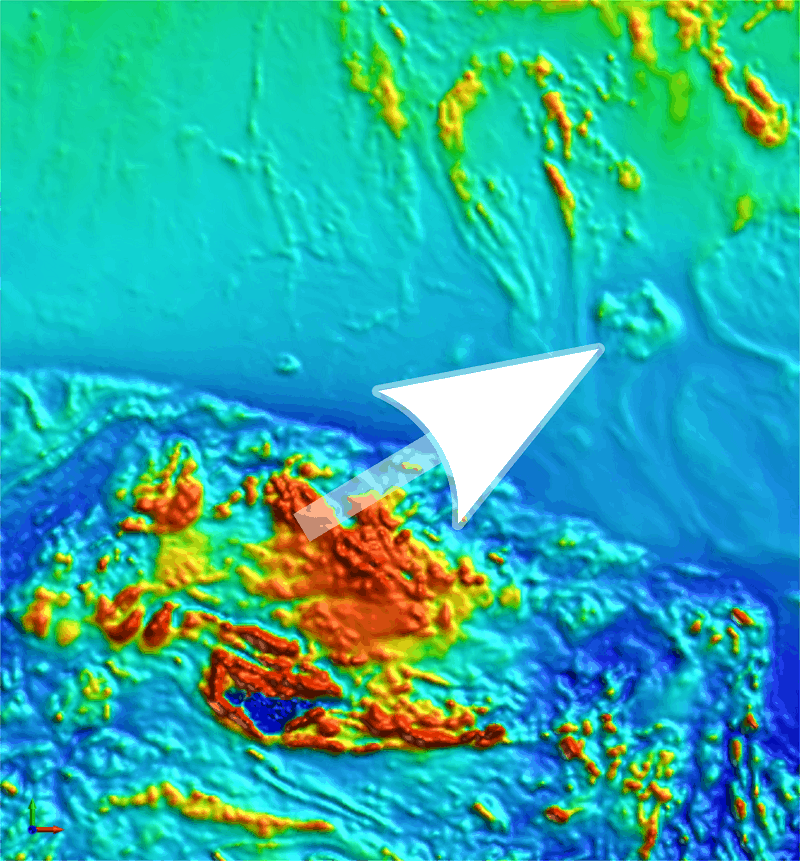
Next, a comparison in a region with high relief. The left-hand image uses the Pseudocolour Green palette; the right uses the CET rainbow_bgyrm_35-85_c69_n256 palette. Note how the highlighted “anomaly” appears rather flat in the left-hand image. In fact, most of its relief is a result of the lighting, not good colour palette design. If the lighting were weaker you could potentially misconstrue it as a massive anomaly, or even miss it altogether. In contrast, the right-hand image reveals a handful of distinct, and much smaller, “anomalies”.
 |
 |
Admittedly, the differences in my examples are very subtle; I’m sure you could come up with more dramatic examples in your workplace. The important thing to remember is that the perceptual uniformity of the CET palettes introduces several advantages to Micromine users:
- They avoid flat spots, where locally low perceptual contrast can hide small but important details.
- They avoid false anomalies, where locally high contrast can appear to represent a structure that isn’t really there.
The palettes are divided into the following categories:
- Linear: colour ramps suitable for general purpose use
- Diverging: suitable for data with values that lie above and below a reference value
- Rainbow: for general purpose use; better suited to presentation maps than technical mapping
- Cyclic: colours match at each end. Best for angular (e.g. azimuth) data
- Isoluminant: colours in these palettes have a constant perceptual lightness. Best used in conjunction with relief shading
To learn more about using the various categories, please visit the CET website.
Be sure to try out these new Features of Micromine 2018 and If you need assistance or any additional information please don’t hesitate to Contact Support.
For more information about Micromine 2018 including it’s new features and improvements please visit our Micromine 2018 page.


